
Photos by Tennessee Titans, Atlanta Falcons, Washington Commanders, John Hadji / Los Angeles Rams, and Baltimore Ravens
Several months too late (but just in time for the start of the season), I’m here to rank the new NFL primary uniforms for this season! Five teams, a number not seen since 2020, rolled out brand-new uniform sets for the upcoming season. We’ll break down all five, comparing them to what they replaced, weighing the individual parts and pieces, and putting all of them in order from worst to first.
(I know the Rivalries uniforms for this season are just about to unveil, but I’ll talk about those in their own post. I also won’t be considering Rivalries uniforms as part of a team’s primary uniform package, since many of them tend to look completely different from the team’s existing brand identity.)
I’ll do this a little more like my grading system for the new Detroit Tigers alternate jerseys. The constituent parts of the uniform (helmets, jerseys, pants, and the displayed combos therein) will each get a grade, and I’ll sum up each set with a grade at the end. Sound good? No? Too bad.
5. Baltimore Ravens
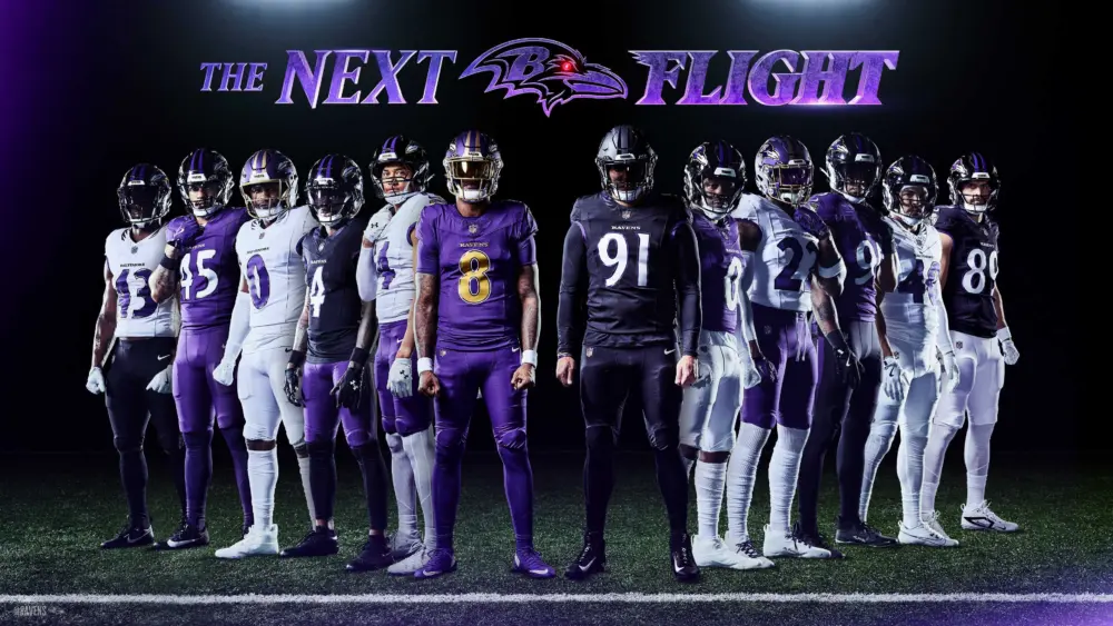
Photo by Baltimore Ravens
Wow, these are…ooh…uh…definitely something, all right. The Ravens had worn essentially the same thing since their relocation from Cleveland in 1996 (with some wonkiness in the early unis that got sorted out within a few years), making this really the first full uniform overhaul in franchise history. Even at that, many recognizable elements from the previous sets are still present, making this more of a refresh than a rebrand. Did it work? Well, it’s at the bottom of the list, so obviously not.

Photo by Shawn Hubbard / Baltimore Ravens Photos
The Jerseys
I will go on record as saying that I did not particularly like the Ravens’ now-departed old uniforms. They were designed in the ’90s, and boy, is it obvious. Perhaps not to the extent of whatever drugs the NBA was smoking at the time; but it’s pretty easy to tell. The number font is a modified version of a common font also used by the expansion Arizona Diamondbacks, the black drop shadows are ’90s as it gets, and the logos give off a distinct air of Gen-X edginess. Beyond that, it’s hard to overlook how…uninteresting they were. Yeah, they were purple, which scores a lot of points with me, but were there any elements of those uniforms that were really all that distinctive?
The point I’m getting at is that the Ravens were working from an unimpressive starting point. They could have made some significant improvements by overhauling their identity. Instead, they gave it a very strange facelift. Those late-millennium, MTV Generation-esque design elements are now awkwardly rubbing shoulders with Gen Z-era design aspects like the iridescent number trim, “stealth” sleeve patches on the alternate jerseys, and whatever the under-thought “wing” collar design is. The Ravens are now stuck in this weird middle ground where they’re both too ’90s and too ’20s at the same time.
Most of the changes made to the previous set have been downgrades. Removing the gold trim from the primaries? Big miss. Black and purple is already a muddy color scheme, and lacking gold just makes it harder to tell the two colors apart from a distance. The aforementioned 2020s design staples are already dated and will be looked back upon in the future as relics of a regrettable era. The collar trim, while I see what they were going for, just doesn’t convey what it’s supposed to well enough. There is one improvement, though: ditching the black drop shadows. Those had been dated for decades and I will not miss them.
On the whole, though? Big whiff.
Grade: C-

Photo by Shawn Hubbard / Baltimore Ravens Photos
The Helmets
With the NFL recently (and regrettably) increasing the number of approved helmets per team to three, the Ravens have taken full advantage. The primary black helmet and alternate purple option are unchanged, but the new third choice is this gross “Darkness Helmet” (their words, not mine) for use with the black alternate jersey. Stuff like this exists for no reason other than to get people on social media to spam fire emojis. It’s probably the single worst element of the entire set, barely matching the jersey it’s meant to be worn with at all. Hard pass.
The other two helmets aren’t particularly great, either. The primary helmet has been unchanged since 1999 and is really showing its age. Just changing the shell to a shimmery purple-black, kind of like the 2009-2012 Jacksonville Jaguars’ teal-flake helmet, would have been a significant upgrade. So, of course, they didn’t do that. The alternate purple is the best aspect of the whole set, probably because the gold-on-purple contrast is far superior to the hard-to-read purple-on-black primary helmet. Still, it’s far from amazing.
Grade: C

Photo by Shawn Hubbard / Baltimore Ravens Photos
The Pants
The old Ravens pants were nothing special, although I was partial to the purple pants with the white jersey. For this refresh, the team apparently took inspiration from the claws of a raven, mixed with the design of the Maryland flag. The result is less than spectacular. I’m already not a fan of stripes that don’t run all the way from top to bottom, and the weird separation between the two pieces just makes the top part float away. Not a fan.
At least the black pants have a stripe now…
Grade: C-
The Combos
These days, the million-dollar question with any new uniform set is when its pieces will be deployed. The Detroit Lions, for example, have a very well-designed uniform set that they are currently flogging to death because they insist on almost always wearing monochrome. The Ravens seem to be opting for the opposite extreme, seeing as the team themselves have showed off a whopping twelve combinations. For an old head (er, young man with an old head) like me, this is overkill, but there are a few decent choices. The purple alternate with gold numbers is the pick of the litter, and the white-over-purple paired with both helmets is halfway decent. Anything that tries to mix purple and black below the neck, though? Oof. No thanks. Let’s hope the players’ seeming desire to always match the socks to the pants, creating a gross leotard look, doesn’t come to pass.
Grade: C
Verdict
I think I’ve made my dislike of these uniforms pretty clear. They took a uniform design that already wasn’t great and made it even weaker. Are they a flop on the level of the two-tone Jaguars helmet set? Definitely not. Are they the worst uniforms in the NFL right now? Probably not, either. But they’re much closer to the worst than to the best.
Final Grade: C-
4. Washington Commanders

Photo by Washington Commanders
There is a massive, and I mean massive, gap in these rankings between last place and all the rest. Baltimore’s uniforms are an embarrassing mess, but the four other teams to get new sets this year all did at least a decent job. Washington righted the massive wrong they made in 2022 when they rebranded as the “Commanders”. That initial Commanders set was a flaming tire fire that wasn’t long for this world after unloved former owner Dan Snyder sold the team, and the team made the entirely predictable choice to more-or-less return to the uniforms they wore as the Washington Redskins.

Photo by Washington Commanders
The Jerseys
There isn’t exactly much to write home about here. The white uniform had already returned to the Commies’ rotation last year as an alternate, making the full rebrand a foregone conclusion. Save for the removal of the “Redskins” wordmark above the front numbers, these are essentially one-to-one recreations of the classic look. There’s nothing wrong with them, although they aren’t my favorite jerseys in franchise history (that honor belongs to the 1970s uniforms with the huge sleeve stripes). Still, they look sharp. My big issue is the inclusion of an unnecessary black alternate. Back when the franchise ditched the Redskins name in 2020, I fully expected something like this to happen now that they weren’t constrained by history, and boy was I right. It’s an ugly piece of post-’90s slop. Can we cool it with the “black is cool” thing already? It’s been over thirty years. Dock a few Two good jerseys and one bad one results in splitting the difference.
Grade: B

Photo by Washington Commanders
The Helmets
Once again, not much is new under the sun here. The primary helmet is just the classic Redskins helmet with the new stencil-W logo. It’s not a great logo, and the lack of white looks a little funky alongside the white stripes, but it does the job. The needless blackout set has its own helmet, which includes a spear for no reason. I guess it’s supposed to call out the team’s 1965-69 uniforms, but this is a strange place for that kind of homage. The logo being burgundy also doesn’t help with legibility, which is a major concern when you put two colors this dark alongside each other. The yellow trim helps, but it doesn’t make the burgundy look any better. Just look at how the “Hail Raiser” text blends into the background in that promo image above. Whatever, I think I’ve made my dislike of this uniform pretty clear by now.
Grade: B-

Photo by Washington Commanders
The Pants
Copy and paste everything I said earlier, these are just the classic Redskins pants, but this time there’s no logo to replace. One thing that is different, aside from the addition of a black pair to go with the butt-ugly alt, is that the yellow pants now have matching stripes. When the franchise resurrected the yellow pants in 2010, the stripes didn’t match the double-stripe pattern elsewhere on the uniforms. Wearing yellow pants at all with these jerseys is a historical anachronism, since they departed this earth in 1978 alongside the big-stripe jerseys. Because of that, I was never clear on why they didn’t make the new yellow pants match the white and burgundy ones. Finally, sixteen years later, that wrong has been righted, and it’s great to see. My OCD brain approves.
Grade: B+
The Combos
There isn’t really much to go off of here, since the team didn’t show off any combos other than classic burgundy-white, classic white-burgundy, and gross all-black. The 2D mockups included in the splash images show all three primary pant designs as being worn with the white and burgundy jerseys, but we’ll see how much mixing and matching they do. (I started writing this months ago before the season began, and so far in the preseason, only the first two combos have been worn.) I’m hoping the yellow pants make as many appearances as possible, especially with the home jersey. But with so little to go on, I’ll give this an average grade for now.
Grade: B-
Verdict
Regardless of your feelings on the Redskins name and history, this was a change that the franchise had to make. The initial Commanders redesign was a disaster, and fans clearly wanted something evocative of more successful times to come back. I’m certainly on board with this redesign, and it would be higher up the list if it weren’t for that dang black alternate. Such are the times we live in, I guess.
Final Grade: B
3. Tennessee Oil-uh, Titans

Photo by Beau Brune / Tennessee Titans
It’s easy to make jokes about these uniforms and why they exist. The Titans own the Houston Oilers’ identity and history, something that people in Houston aren’t particularly happy about. Regardless, the Titans’ ownership is incredibly hostile to the idea that anyone other than them can use the Oilers’ branding. The NFL even went so far as to send the University of Houston a cease-and-desist letter over the Cougars’ own Oilers-themed alternates. But after years of hoarding the Oilers iconography away in storage, the Titans have whipped out a new Oilers-themed primary design to replace their unpopular previous set.

Photo by Donald Page / Tennessee Titans
The Jerseys
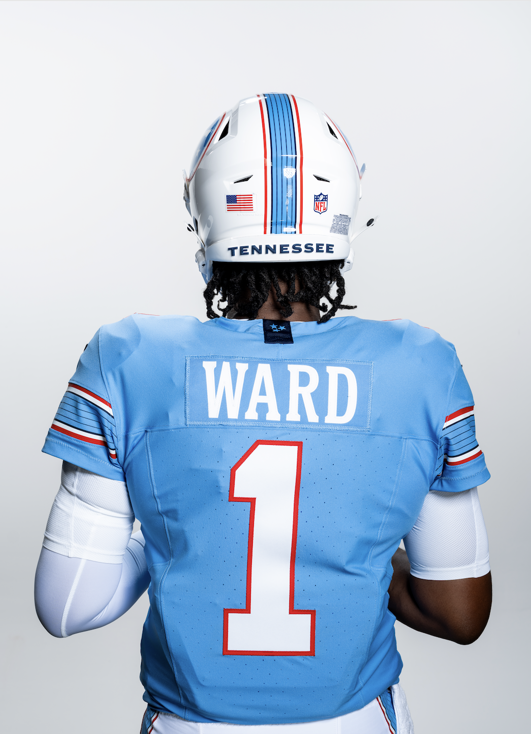
Unlike Washington, who essentially just brought back their throwbacks with minuscule differences, the Titans did make some noteworthy changes to their Oilers predecessors. There’s a new wordmark in a custom typeface, which is fine. I do find it weird that they kept block numbers when they really don’t jive with the custom letter font at all. This is particularly notable on the back of the jersey. The center blue stripe is much thicker than on the throwbacks, and there’s a navy blue guitar-string pattern incorporated into it. Although, as a guitarist myself, the fact that the top and bottom navy stripes are thicker than the others is totally inaccurate and confusing. There’s also very little navy blue elsewhere in the set, which a lot of people don’t like. I’m fine with it, though, since the classic Oilers color scheme looks great by itself. These changes aren’t exactly revolutionary, but they don’t ruin what is still a timeless design.
Grade: A-

Photo by Tennessee Titans
The Helmet
Unfortunately, we go from the best part of the redesign to the worst. The new helmet is greatly inferior to the Oilers classic. There’s a white facemask instead of red or even blue, both of which would make for a much better contrast. The logo is just a stripped-down version of the old “flaming thumbtack” one, which was already a weak logo. Other than the guitar-string stripe, there’s very little of note to talk about here. Not terrible, but not great either. At least there’s only one.
Grade: B-
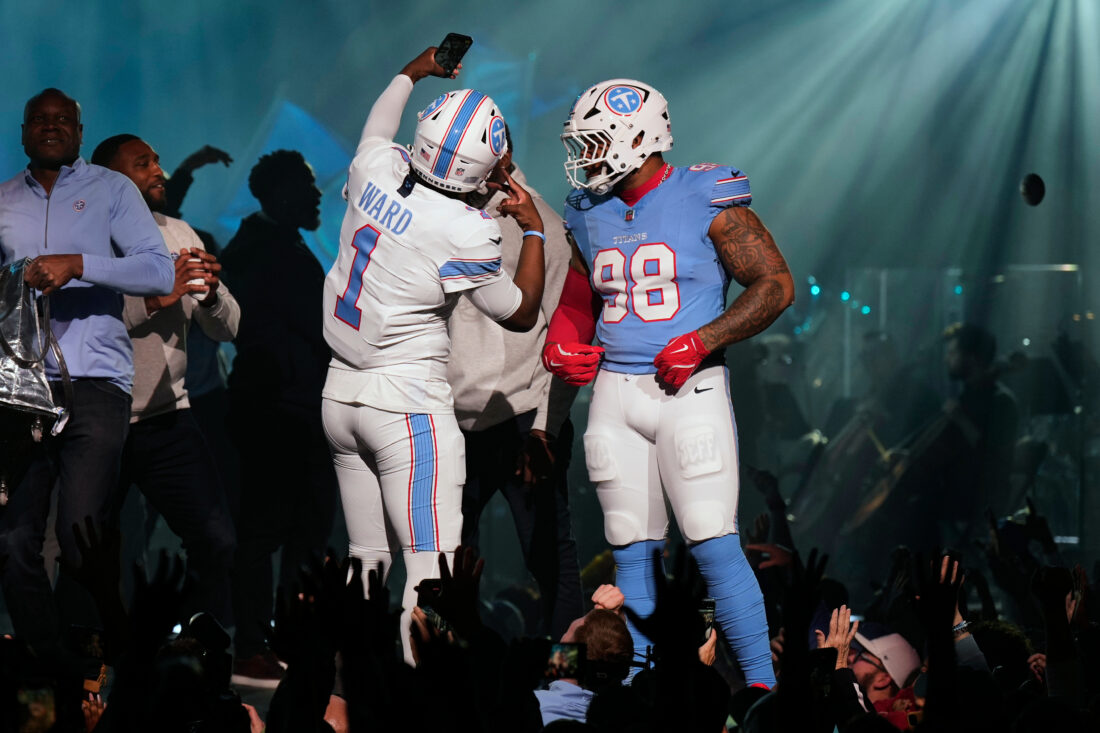
Photo by AP Photo / George Walker IV
The Pants
The guitar stripe carries over onto the pants, which is refreshing in a world where more and more teams are either foregoing pants stripes or designing stupid ones (Baltimore, Denver). However, I don’t like the “master stripe” design, where the stripe colors don’t change with the pants color. In essence, that means the stripes show up much better on the white pants than the blue ones. This problem is mitigated somewhat on the blue jersey, given the heavy amount of white and red on the numbers, but the pants don’t have that luxury. Still, the color scheme is good enough to bail that design choice out.
Grade: B
The Combos
What’s also refreshing is that the Titans have only shown off three, count ’em, three combinations. No crazy mixing-and-matching here. The problem is that the all-white seems to be the default road look over the superior blue-pants option. I’m so tired of the all-white “stormtrooper” look. It’s boring and reduces team colors, one of a team’s most important branding elements, to a minimum. With luck, we’ll get some more blue pants as the season goes on. But all things considered, I’m happy with this.
Grade: B+
Verdict
It’s been nearly thirty years since the Oilers brand was retired to birth the Titans, and the fact that we have only briefly seen Oilers throwbacks in the intervening years is tragic. It’s great to finally see this classic given a new lease on life, but it feels like these were kind of undercooked. The logo is a downgrade, the new striping pattern is all right but not amazing, and the helmet is kind of a whiff. There could have been more done here. Ownership’s insistence on ruthlessly maintaining the Oilers identity is also frustrating and a little icky. Regardless, these are still by far the best uniforms the Titans have had since the name change in 1999.
Final Grade: B+
2. Atlanta Falcons
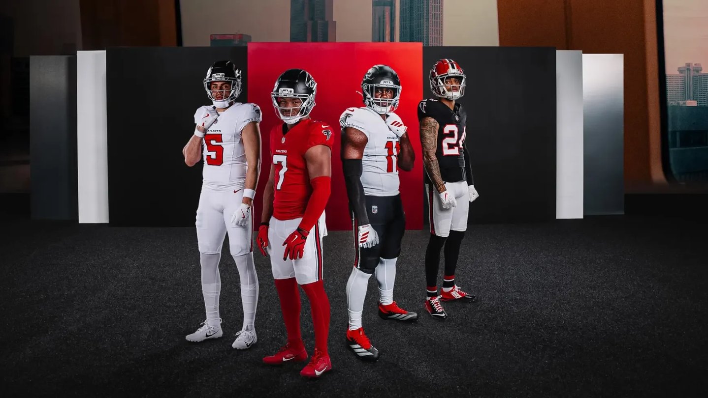
Photo by Atlanta Falcons
Man, did the Falcons need this change. This is a franchise that hasn’t had a great uniform set in over thirty-five years. The set they just ditched was one of the worst in the league, embodying many of the worst aspects of turn-of-the-decade design. Thankfully, they’ve learned from that and created their best suite of unis in a very long time.

Photo by Atlanta Falcons
The Jerseys
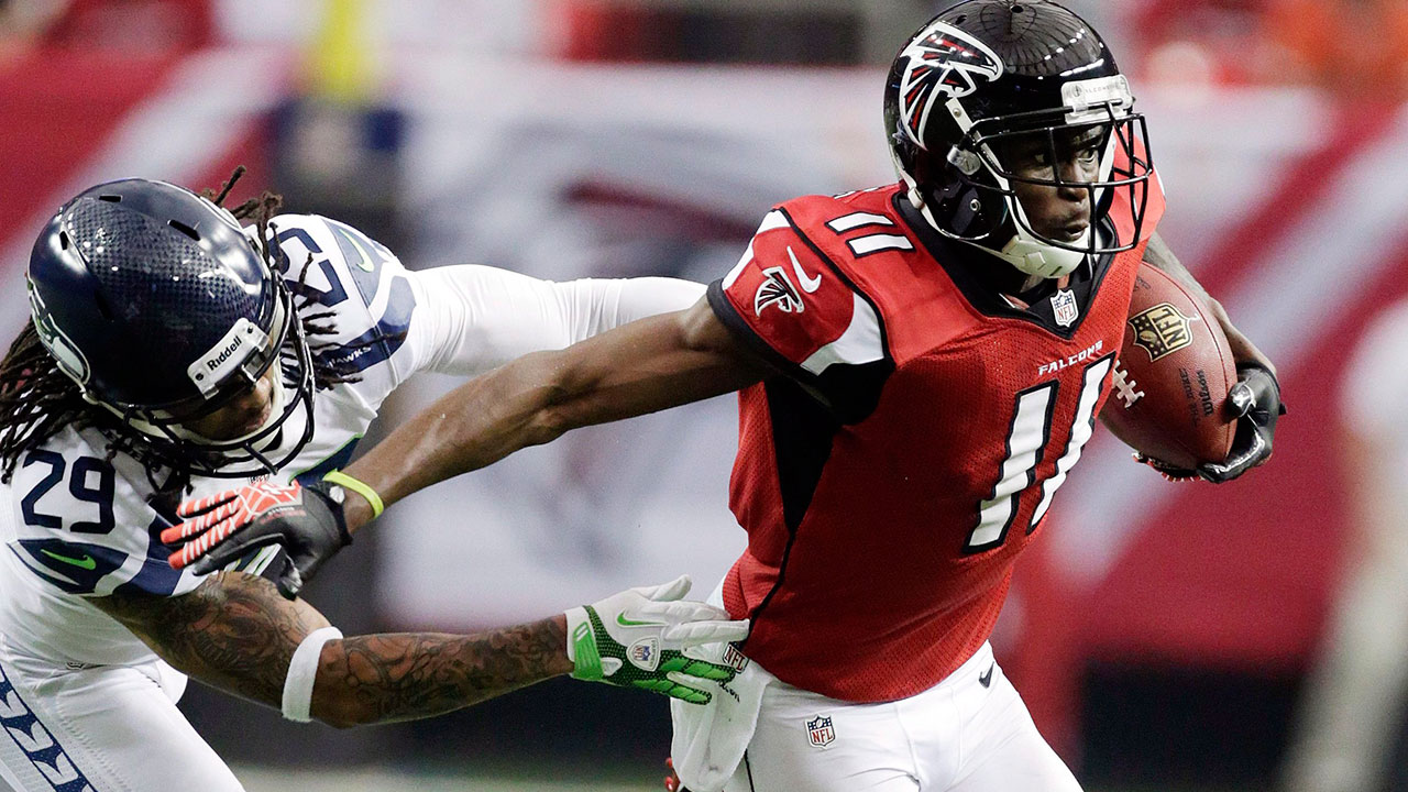
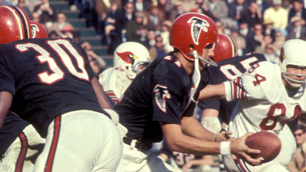
As a child of the late 2000s and early 2010s, it makes me incredibly happy to see the Falcons back in red home jerseys. Their six-year experiment with black at home from 2020 to last year totally neutered the color balance, making the whole set look bland and monochromatic. This change is a massive, massive improvement. I do wish there was something going on with the jerseys besides numbers and a logo on the sleeves (maybe stripes to go behind the falcon, much like their late-Eighties set), but there’s something to be said for putting simplicity first. I dig the custom number font, and there’s nothing about them that I would call “bad”. The 1966 throwbacks they’ve had for several years are sticking around, which is something I don’t feel strongly one way or the other about.
Grade: A-

Photo by Atlanta Falcons
The Helmets
Like with Tennessee, we unfortunately have to pump the brakes on the optimism once we get to the helmet. The helmet isn’t really different from the last rebrand, although the finish of both the shell and the mask have changed slightly. I don’t like the smooth satiny finish or the gray mask, both of which look out of place. The logo is probably also the weakest part of the set and could use a refresh to ditch those weird red movement lines. I preferred the helmet they had during the Matt Ryan era, which was just gloss black with a black mask. I know I criticized the Titans for matching the mask and shell colors, but I think it makes a lot more sense for Atlanta. The red helmet for the throwbacks is something I’ve never been that fond of. Red helmets over black jerseys was always a strange choice, and the retro logo is even worse than the modern one. Whatever, it’s fine.
Grade: B-
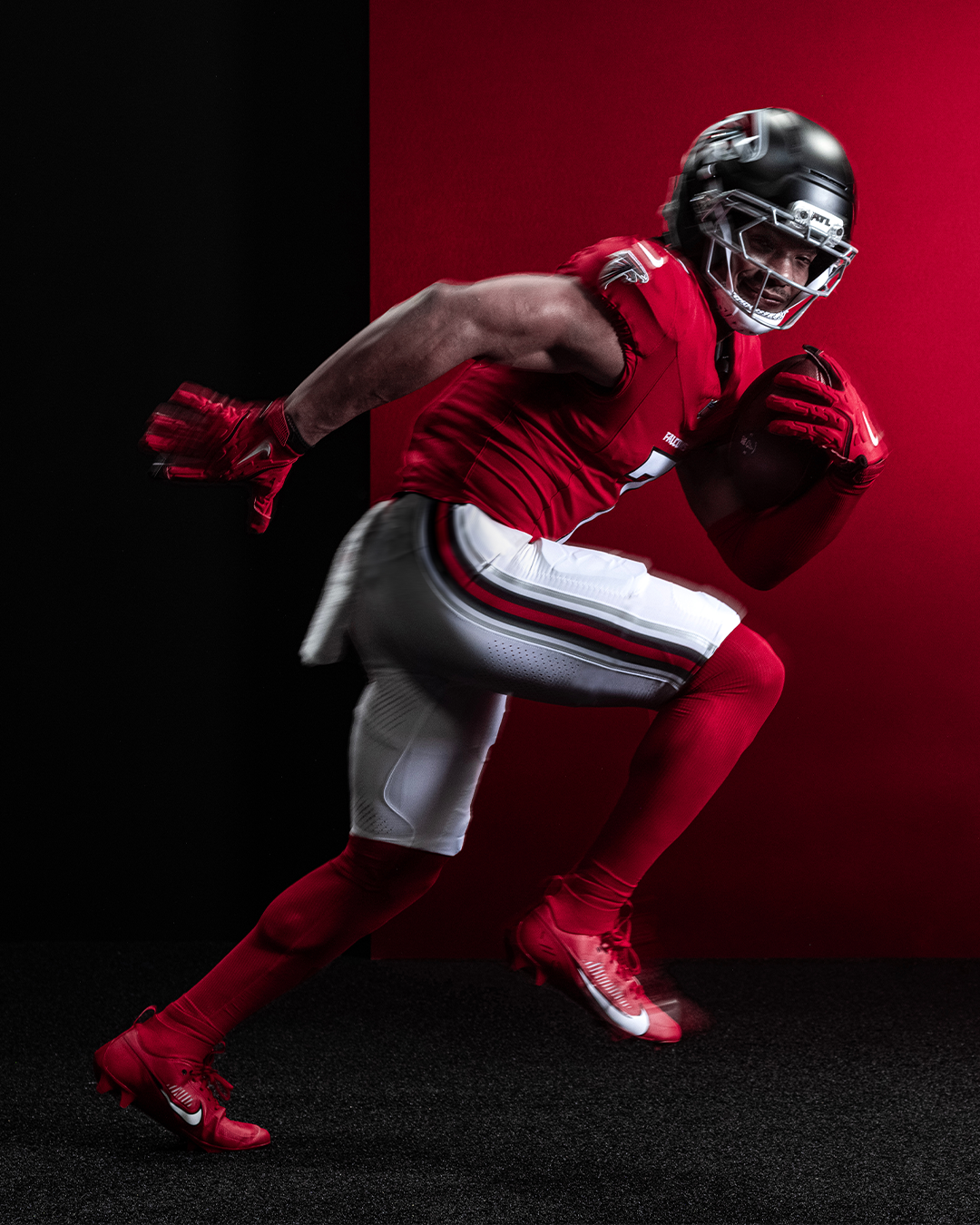
Photo by Atlanta Falcons
The Pants
This is an interesting case. The pants feature a striping style not used anywhere else in the uniform, one which doesn’t really jive with the relatively minimal vibe used elsewhere. Trust me, I’m more than happy to see the pants have stripes at all, I just find them a little out of step with the general design. Apparently, the inspiration came from the inaugural 1966 uniforms, although those featured three stripes instead of the seven on display here. The added inclusion of silver, which is kept to a minimum outside of the facemask, is another odd decision. There’s white pants and black pants, both of which look perfectly fine. Overall, they’re solid but odd at the same time.
Grade: B
The Combos
From the looks of it, there will only be four combinations on offer: red-over-white, white-over-black, all-white, and throwback. It shouldn’t be surprising that the all-white is my least favorite part, so of course that’s the road look they seem to be pushing the hardest. Without the helmet, they look a lot like the Cardinals, which is not a great thing. Red or black socks would help immensely, but I guess we can’t have too many nice things at once. The other options are all good, particularly the home black-red-white-red. I really can’t overstate how happy I am to see this return, and in a much better form than the instantly dated 2000s set. That goes a long way toward how I feel about this rebrand as a whole.
Grade: B+
Verdict
Honestly, this verdict could just be three words: “Red is back!”. The switch back to red home jerseys really made all the difference in the world. While I’m not thrilled with some of the choices (helmet and logo could use some work, stormtrooper road look sucks), this is a vast improvement from what came before. For the first time since my parents were in high school, I can say the Falcons undeniably look very good. Of all the new looks this year, Atlanta’s home set is probably the one I look forward to seeing the most.
Grade: B+
1. Los Angeles Rams
Photo by Los Angeles Rams
This was a change six years in the making. In 2020, the Rams unveiled their first uniform redesign since their move back to LA, and it was…kind of a mess. The road jersey was an awful “bone” color, the jerseys had these inexplicable name tag-looking patches, there were gradients everywhere…it was a shambles. They immediately began to rectify that by unveiling a new white jersey the following year, which they would go on to win a Super Bowl in that very season. The writing was already on the wall by that point, and they completed the circle with a minor identity refresh this year.
(Note: I originally planned for this to come out months ago; but in the time since, the Rams unveiled two new retro-themed alternates. I will consider these as part of the rebrand, though I will not include the Rivalries alternate for reasons laid out in the preface of this blog post. Also because I hate it.)

Photo by John Hadji / Los Angeles Rams
The Jerseys
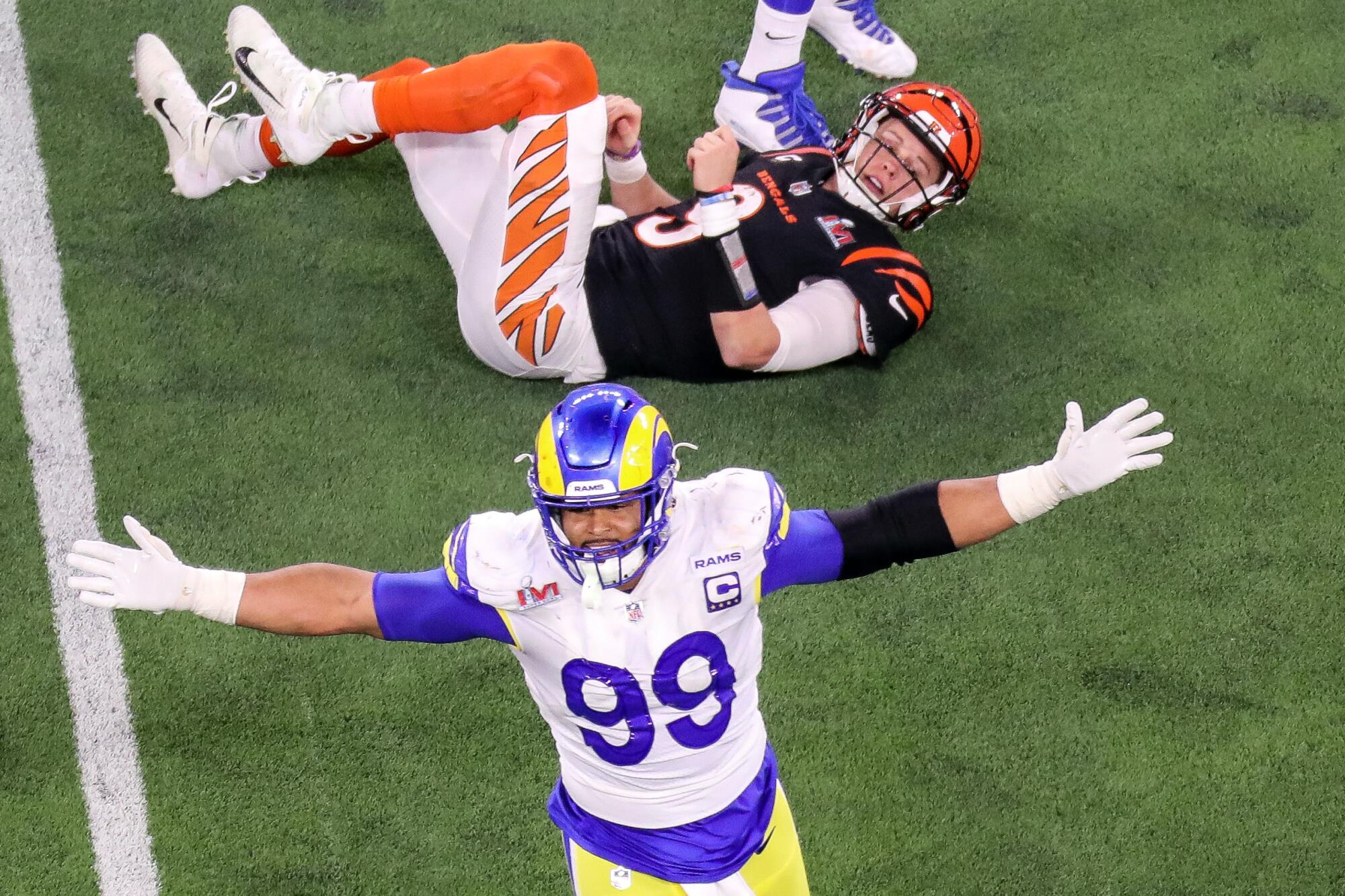
If there was a single phrase I could use to describe the Rams’ 2020 debacle, it would be “aggressively baffling”. There were so many design choices that were just utterly confusing in their concept and execution, particularly on the vomit-inducing bone jerseys. Thankfully, the majority of those changes have been rolled back. Gradient numbers? Gone. Shoulder stripes that don’t come to a point like actual ram horns do? Gone. Name tags? Gone. With all that clutter now chucked in the wastebasket, the Rams finally have begun to harness the true potential of this uniform set. The swirly texture in the numbers is still annoying, and I wish they would darken the shade of blue just a little, but this is far superior to what it replaced. The yellow alternate is fine, although the white Sixties-inspired option is not nearly as good. It’s a bland uniform that I don’t know why anyone would want to return, and the shoehorning in of black trim is doubly annoying. Still, on the whole, this is solid progress.
Grade: B+

Photo by John Hadji / Los Angeles Rams
The Helmets
Disappointingly, one thing that hasn’t changed from 2020 is the segmented helmet logo. It’s apparently supposed to resemble actual ram horns, though I don’t see the similarity. To me, it smacks of overthinking something just because you can. But the Rams’ helmet is iconic for good reason (they were the first NFL team to ever feature a logo), and it still looks good in spite of itself. Why they chose to pair it with the fauxback uniforms is more confusing, though, but that isn’t really the helmet’s fault. It’s a fine look that could be great if they would just do what they had done for decades upon decades and get rid of the segment in the horn.
Grade: B

Photo by John Hadji / Los Angeles Rams
The Pants
The pants really haven’t changed very much at all from 2020, which is fine. There’s a new pair of white britches because it’s 2026, but I can tolerate that. They look all right. The blue pants now have the same striping pattern as the others instead of the gradient stripe they used too, which is a vast improvement. The alternate pants follow the trend of the full uniforms, with the Fifties-inspired ones being okay while the Sixties-looking ones are probably the weakest part. But they’re pants, so whatever.
Grade: B
The Combos
There’s a lot of different ways this could go, and I don’t really know where the Rams plan to start. The blue pants were probably the most downplayed part of the set in the initial teasers, but they’ve been worn (with white jerseys) for both preseason games so far. Really, the only objectionable combos are the monochrome options (of which I fear we’ll see a lot of the white in particular) and the white fauxback. Anything with yellow pants is going to be an immediate hit, as will white-over-blue. If they stick to those core looks with occasional appearances from the white pants and the alternates, I think there’s going to be something really good happening here. But we’ll just have to wait and see.
Grade: B+
Verdict
Really, these could be 1A and 1B with Atlanta, but I’ll give the Rams the top spot for now. The “Fearsome White” alternate is by far the weakest part and the set as a whole could still use some tweaking, but I feel pretty confident that the Rams will look quite good almost every week. This set went from “has potential, but with major drawbacks” to “has potential, but with minor drawbacks”. If nothing else, many of the issues from 2020 were fixed, and the team deserves credit enough for that.
Grade: B+
Final Thoughts
On the whole, this was a positive year for NFL rebrands. Four of the five teams made improvements over their previous look, most of them by significant margins. None of them are stone-cold classics, as evidenced by the lack of any A final verdict grades, but this is distinct progress. As long as these teams can restrain their worst impulses (mostly toward monochrome combinations), I’m excited to see all of them (except Baltimore) take the field this fall.
Join me sometime in the near future to discuss the new Rivalries uniforms, and how much they will likely make me want to jump off the roof of my apartment building given the slop that we got last year. Fun for the whole family!










/cdn.vox-cdn.com/uploads/chorus_image/image/68891844/1292829242.0.jpg)
