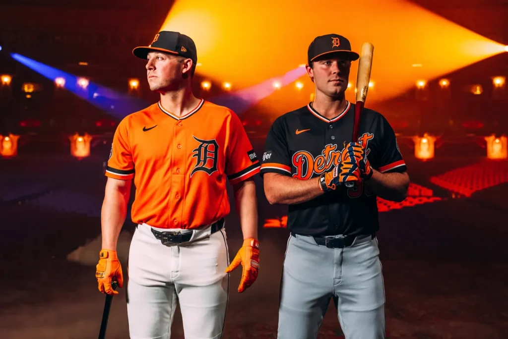
Photo by Ilitch Sports + Entertainment
Anyone who knows me knows that I’m a huge fan of sports logos and uniforms. They’re probably the single biggest reason why I decided to become a graphic designer in the first place. So I decided it would be a good use of my blog space to critique some new designs as they come out, starting with these recently released alternates from the Detroit Tigers.
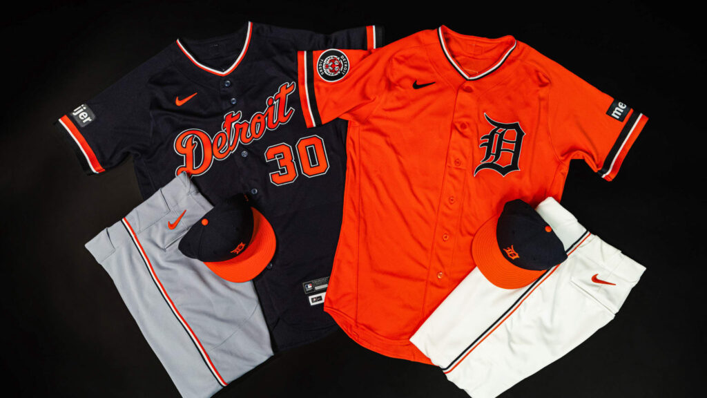
Photo by Ilitch Sports + Entertainment
The Orange Jersey
It’s honestly jarring seeing the Tigers wear this much orange. They’ve always been a blue-and-white team, to the extent that their home uniforms feature no orange whatsoever. That makes the decision to wear these as a home alternate especially strange, although putting the “D” on the front of the jersey helps tie it in to the regular white jersey. Still, the color balance is pretty good, and I like the sleeve patch, although I would prefer if they used the tiger head on its own without the roundel. The collar and sleeve trim resembling their 1972-93 road jerseys is a nice historical addition, and I think the orange-brim cap looks really good too. I do have one small gripe, though: the back numbers are in MLB’s standard block font instead of the Tigers’ traditional Varsity Block (as seen on the blue jerseys). Huh? The biggest problem, though, is that the Tigers have (almost) no history with alternate uniforms, and there’s really no reason for these to exist other than to extract more dollars from fans’ wallets. It’s good, but is it really that necessary?
Grade: B
The Blue Jersey
The blue jersey is, more or less, a simple palette swap of the orange one. That’s hardly a bad thing, and it also works pretty well. The orange pops well off of the blue base, and it’s not as visually unexpected as the orange jersey. Since this one will be used on the road, the “Detroit” script is a smart choice. The problem I have with this jersey, though, is that it has double-outline slathered all over everything. This is one of my biggest pet peeves as a designer: double-outline is basically always worse than single-outline. While this jersey isn’t one of the worst offenders, I can’t help but think it would look superior with the extra blue outline removed. Everything else is pretty much the same as the orange jersey (with the exception of the correct number font), leaving this as a pretty solid jersey that doesn’t really need to be here.
Grade: B
Verdict
These uniforms are…fine. They do several things right, a few things wrong, and don’t hurt my eyes when I look at them. There are some missed opportunities, such as standardizing the number fonts and trim, and I think this would have been a good time to put their “Tigers” script on at least one of these jerseys. But, especially with how screamingly awful Detroit’s City Connect is, these could have been far worse. The best solution, at least in my eyes, would be to drop the orange jersey and have one blue jersey with the “Tigers” script and single-color white outlines. Still, I don’t think the world would be a worse place if the Tigers kept the white and gray as their only uniforms in regular rotation.