Photo by Nike
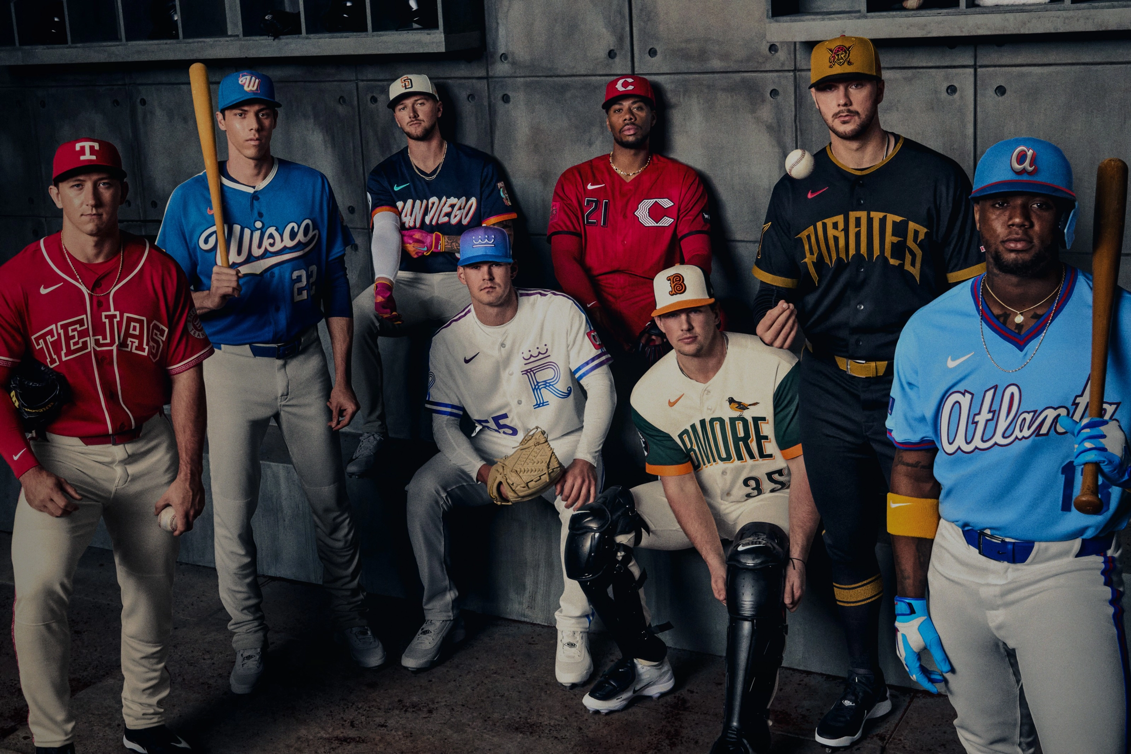
Has it really been two months? I’ve been super busy over that time with work, life, more work (switching jobs), more life (moving to a new city), and trying to finish the approximately 8,000 personal projects I’ve been working on. But now that things have settled down somewhat, I think it’s time to get back into sharing my opinions on this here lovely blog. And what fortuitous timing, too, as eight Major League Baseball teams just released their new City Connect alternate uniforms. So let’s rank all of them!
I’ll use a little different criteria for ranking these compared to how I graded the new Detroit Tigers alternate uniforms. I’m going to consider each uniform in three categories on a scale from one to five. The three categories are as follows:
General aesthetics, or simply, how attractive the design is to look at.
City connection, or how well I feel each design incorporates the requisite local theming. I personally dislike the extreme emphasis Nike and the teams place on this point; but local color can make or break a design.
And finally, brand consistency, or how well the uniform fits in the team’s established brand identity package. This is generally my biggest critique with these designs, in that they stray too far from what the team generally looks like. But not every one is equal in this regard.
All three criteria will be added up to get a score out of 15, which will determine how the rankings shake out. To break ties, I’ll just use my own personal bias. Without further ado, let’s start at the bottom:
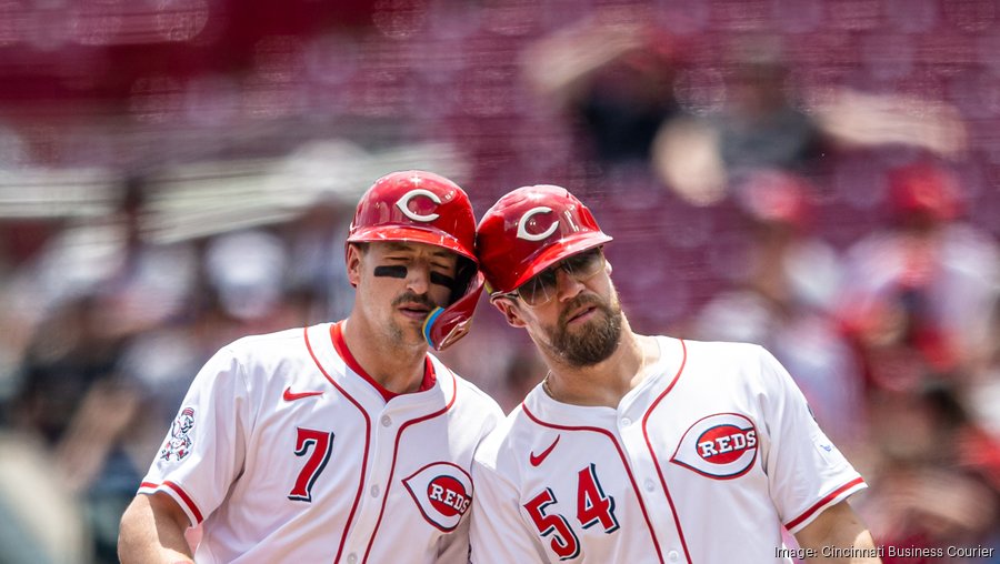
8. Cincinnati Reds

Photo by MLB
I will admit, these are better than the projectile vomit-inducing look the Reds rolled out with their previous entry in the City Connect program. (What’s that? That uniform is still around as a regular alternate? Has God truly abandoned us?) But there’s just not much that can be done to salvage this look. The “modern” wishbone C is still over designed and ugly, ruining the charm of the original, and the number font is still a terrible idea. The all-red is a funny idea that is way too much in practice, the team’s continued insistence on shoehorning black into their color scheme is tiresome, and there isn’t really a single thing about this set that I would call particularly good. Even the local theming is downplayed, with a sleeve patch serving as the only real link to the city. Just bad all around.
General aesthetics: 1/5, City connection: 2/5, Brand consistency: 2/5, Total: 5/15
7. Milwaukee Brewers

Photo by MLB
The big problem with these can be summed up in one word: “Wisco”. Not only are these abbreviated place names really starting to grate on me, but doesn’t it defeat the entire purpose of a “City Connect” to bail on the city and go with a state-wide theme after only one previous design? It just feels like Nike ran out of ideas. The rest of the design does little to help with that impression, although the wheat-patterned shoulder stripes and the ever-enjoyable Beer Barrel Man sleeve patch are worth keeping. But the gradient trim is annoying, the design as a whole is staid and unremarkable, and I just can’t get past the “Wisco” on the chest.
General aesthetics: 3/5, City connection: 2/5, Brand consistency: 1/5, Total: 6/15
6. Kansas City Royals
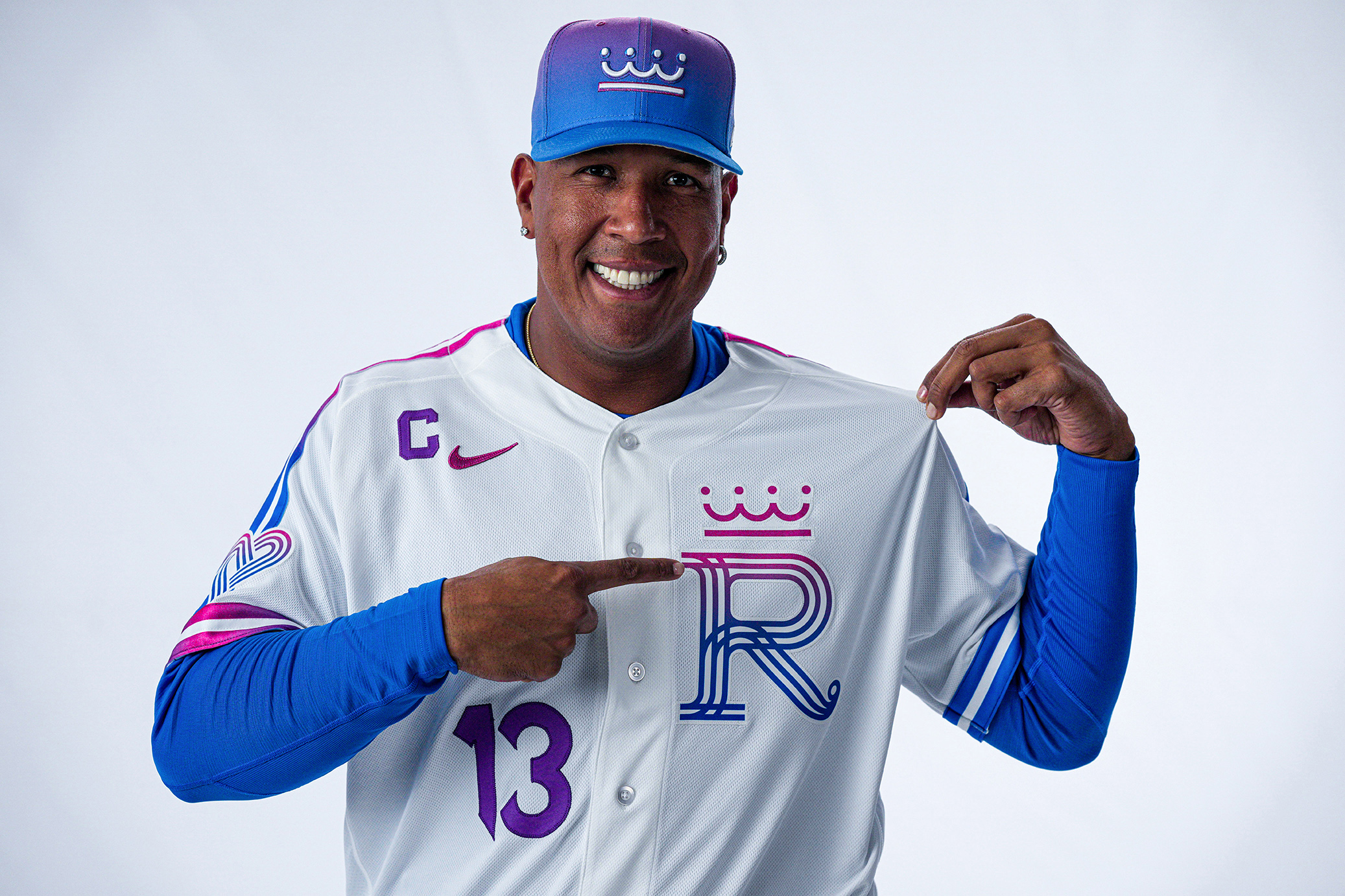
Photo by Jason Hanna / Kansas City Royals
Oof, this one hurts. The Royals are one of my favorite teams, and their first City Connect was probably the single best design the program has produced. I didn’t hate this one when I first saw it, but further inspection has not been kind. The unpleasant pinkish-blue gradient infests almost everything about these, looking worst on the batting helmets. Also, what the heck is happening with the back numbers? Just because it matches the logo doesn’t mean it’s a good idea. The logos are carried over (mostly) from CC 1.0, and they still look good, as does the new heart sleeve patch. It’s also white-over-white, which a lot of the better (read: less objectionable) CCs have been. These aren’t unsalvageable, but they are a massive downgrade from the near-perfection that was the prior design.
General aesthetics: 2/5, City connection: 2/5, Brand consistency: 3/5, Total: 7/15
5. Texas Rangers
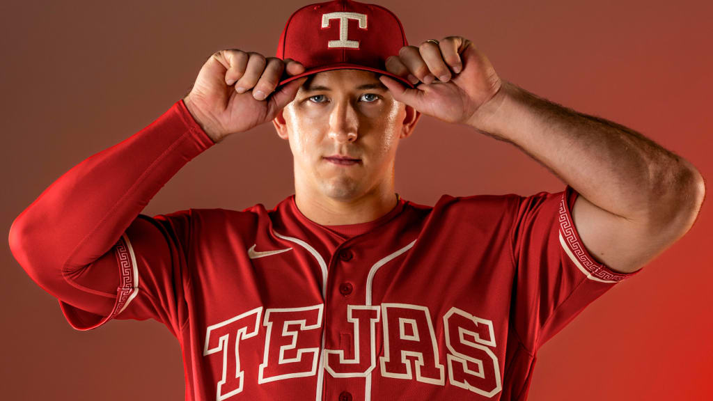
Photo by MLB
The problem with the majority of these City Connect designs is that they try doing too much. Too many colors, too much “storytelling”, too little connection to the team’s actual brand identity. But this one, strangely, has the opposite problem: it feels remarkably undercooked. On a positive note, it definitely feels like a Texas Rangers uniform. The cap logo and wordmark are a callback to the (rather bland) 1986-1993 set, and the red-heavy identity reminds me of my favorite Rangers uniforms, the 1994-2000 look. The local theming is also well done, with the “Tejas” wordmark, sleeve patch, and trim all managing to be meaningful yet restrained, another rarity for this program. So what’s the problem? Well, it mostly comes down to the lack of any supporting color besides white. Lettering and numbering being the same color as the jersey base is a major pet peeve of mine, and this really hamstrings the rest of the set. Also, the design is so plain as to almost be distracting. I don’t want more gradient insanity like Kansas City, but this feels like an overcorrection. If these incorporated a third color (green for Mexico?), they would shoot up the list.
General aesthetics: 2/5, City connection: 3/5, Brand consistency: 4/5, Total: 9/15
4. Pittsburgh Pirates
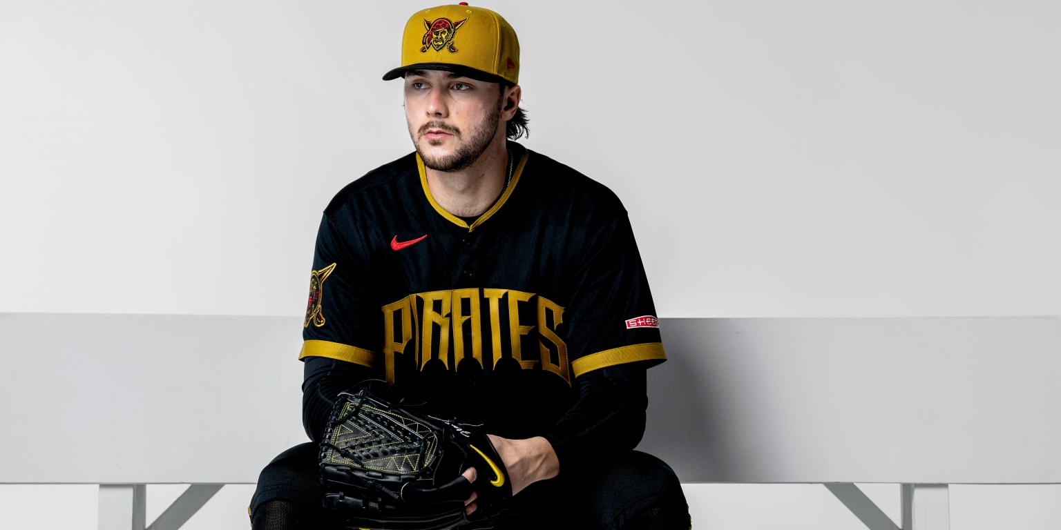
Photo by MLB
Honestly, these uniforms do a lot of things well. They use Pirates colors, they use Pirates logos, and they pay a little homage to Pirates history with the mustardy shade of yellow and the colored pants (even if those were from different eras). So where do the problems come in? Well, for starters, the font is hideous. I know it’s supposed to be pirate-themed, and the curved bottoms apparently resemble Pittsburgh’s bridges, but none of that matters when the finished product looks butt-ugly. The addition of red into the color scheme isn’t done poorly, but it does bring back bad memories. Besides, almost none of this has anything to do with Pittsburgh. The pirate theming is fine, but the team wasn’t named the Pirates because it had anything at all to do with the city of Pittsburgh. These are fine for what they are, but the “City” portion of “City Connect” is mostly AWOL, and they’re far from my favorite Pirates uniforms.
General aesthetics: 3/5, City connection: 2/5, Brand consistency: 4/5, Total: 9/15
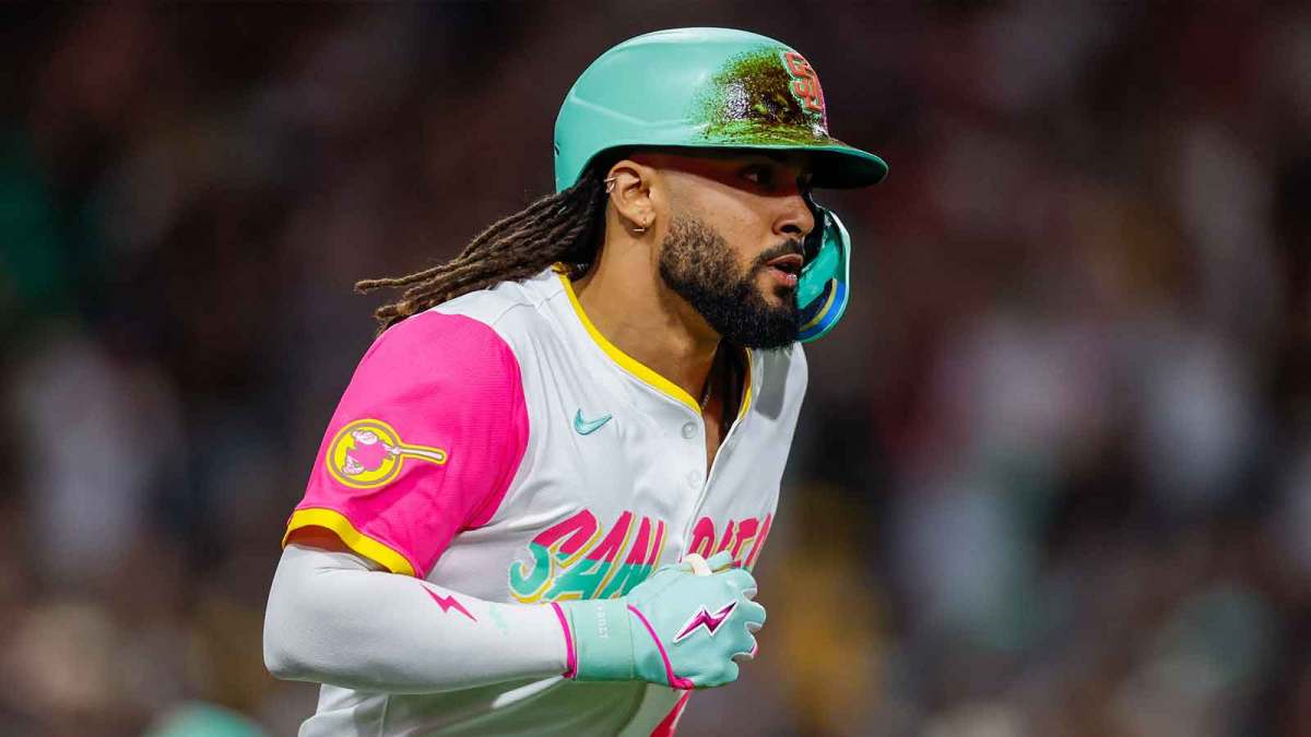
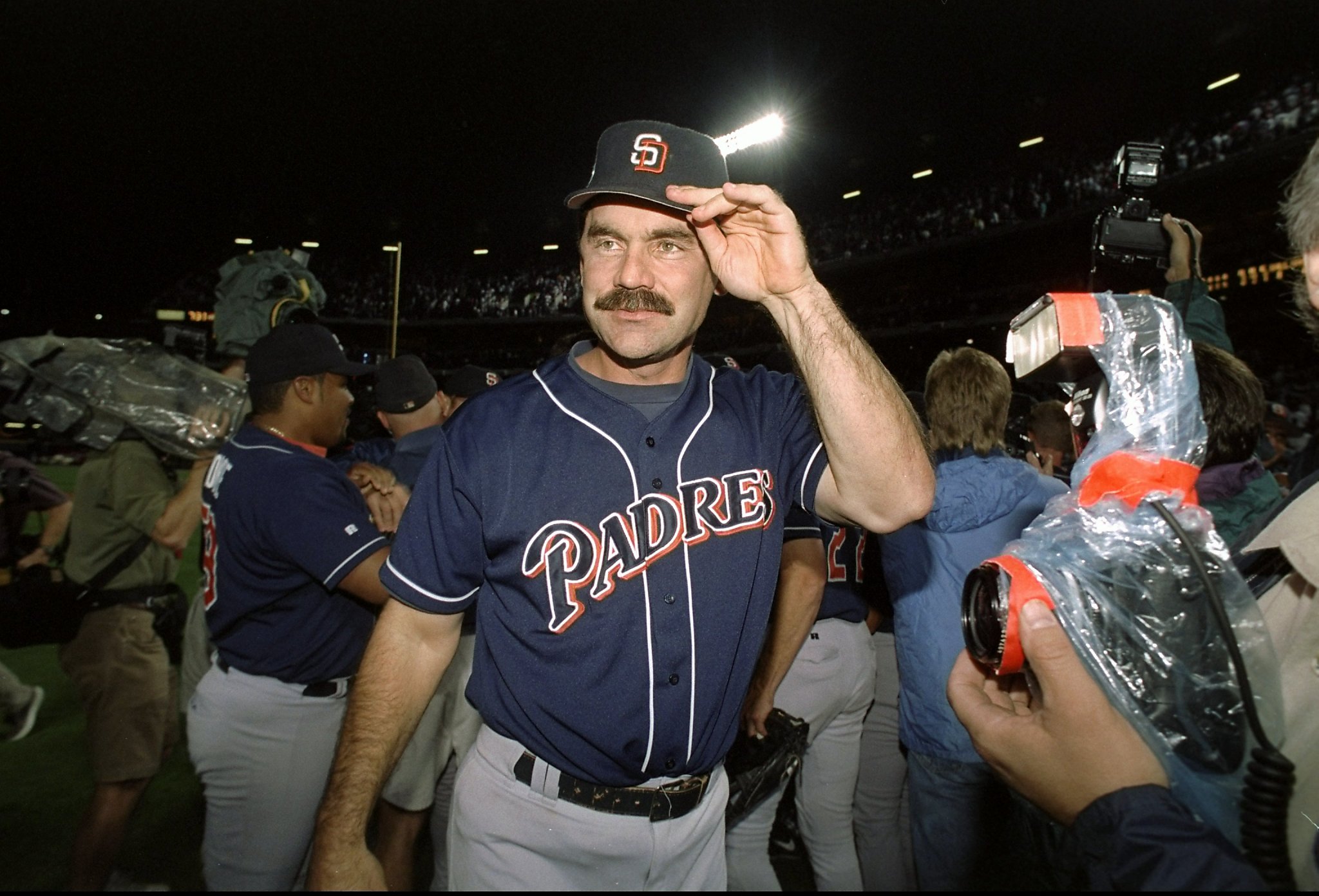
3. San Diego Padres

Photo by Matt Thomas / San Diego Padres
I can’t tell you how relieved my retinas are that the prior San Diego CC has bitten the dust. Wisely, this set opts for a more restrained color palette that ties in the franchise’s old colors of navy blue and orange. I don’t care for the splotchy wordmark, but it works much better on this base. I also actually really like the hat. The Día de los Muertos theming is kind of underplayed, only being really obvious on the (rather overdesigned) sleeve patch. But, particularly from a distance, these uniforms look fairly good. I don’t love them by any means, but I also don’t really have any reason to hate them. It’s a low bar to clear, but these definitely clear it.
General aesthetics: 4/5, City connection: 3/5, Brand consistency: 3/5, Total: 10/15
2. Baltimore Orioles

Photo by Baltimore Orioles
The top two uniforms on this list are the only two that I would explicitly, unequivocally say are “good”. Perfect, certainly not; but good, absolutely. The Orioles’ design is themed around Camden Yards, a smart choice that allows the team to utilize a very sharp color scheme of green and orange. These colors really make the whole set work. It’s a very underrated look that I can’t think of many others using (Florida A&M…anyone else?). The white base with green sleeves works really well, and the hat is good if a bit overdone. My real problem is with the type and wordmark choices. The font looks uncomfortably close to the Reds’ Gaslight font, which I’m already not a big fan of, and “BMORE” is a laughably bad choice for a wordmark. It’s also large enough to be seen from space, and the oriole on the “R” looks like a lazy Photoshop job. That aside, these are very nice-looking, and hopefully the team will be smart enough to keep this theming whenever Nike forces them to adopt a new CC.
General aesthetics: 5/5, City connection: 3/5, Brand consistency: 2/5, Total: 10/15
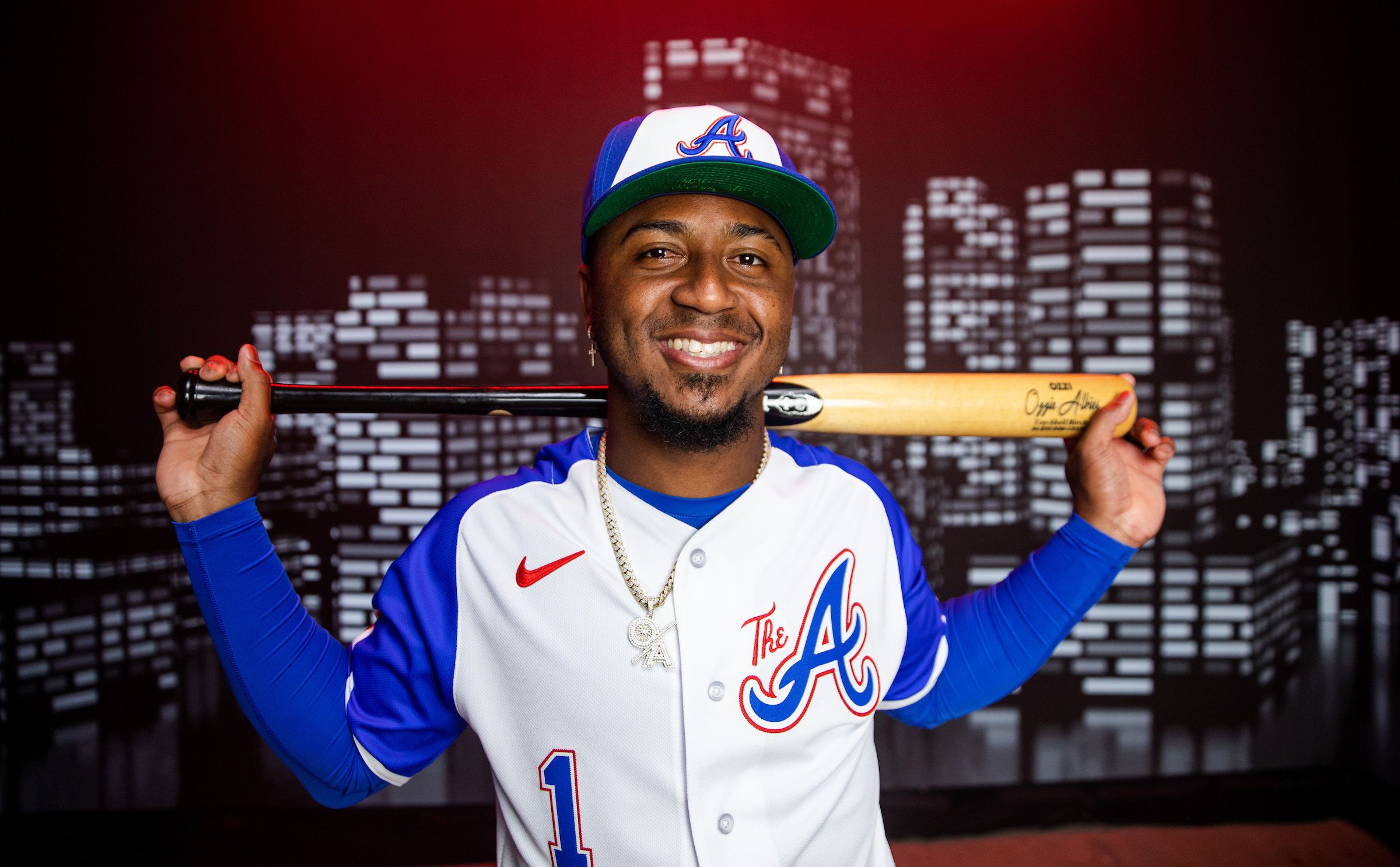
1. Atlanta Braves
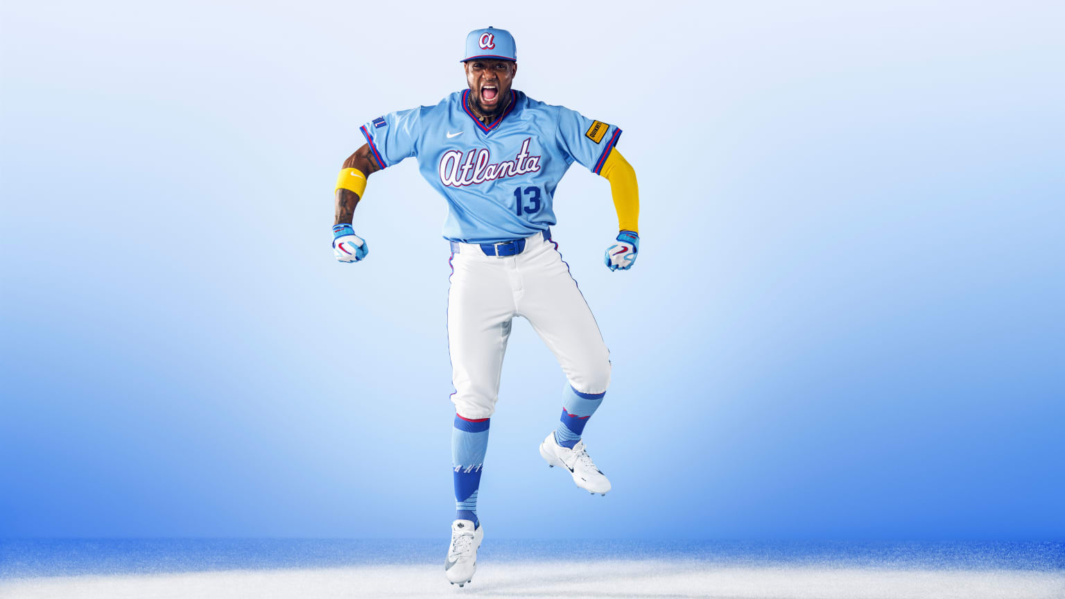
Photo by MLB
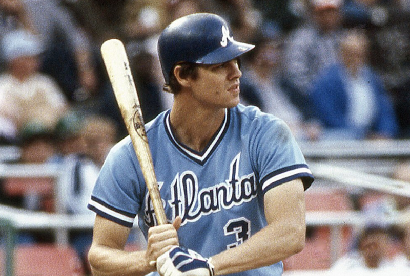
If once is an isolated event, twice is a pattern. The Braves’ first CC had essentially nothing to do with Atlanta and served mostly as a throwback. This one does a similar thing, but is a far more attractive design on the whole. The powder blue is an homage to the early-to-mid-’80s Braves uniforms, which I’ve always found to be strange in their total lack of red. These fix that problem, which really gives the whole thing a lot more pop. I still don’t like the “lowercase-a” wordmark, which the team used from 1976 to 1980, but it doesn’t ruin the look by any means. If I had any major criticisms, it’s that the numbering and lettering can’t decide what color they want to be. The front number and name-on-back are single-color royal blue, but the wordmark and back numbers are white with royal and red trim. Standardizing that would help significantly. Other than that, this is just a really solid look that I genuinely don’t mind seeing on the field.
General aesthetics: 5/5, City connection: 1/5, Brand consistency: 5/5, Total: 11/15
General Thoughts
I have never been much of a fan of the City Connect program. I love brands that are consistent and unified, and many of these (looking at you, Colorado) take their existing team’s brand identity and smash it into a million pieces. On the whole, though, I think 2026’s crop of CC designs are fine. There aren’t any horrific failures, and there are a couple that I do genuinely like. I still find the entire thing unnecessary; but if this is the level of quality we can expect going forward, I’d be okay with that.
(Just wait, next year’s set will be awful and make me regret my life choices.)
